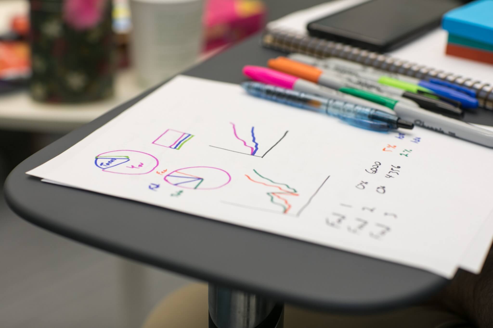
Using Visual Tools for Evaluations: What Can They Add to the Process and Outcomes?
Evaluation reports tend to be dense and wordy! When I worked as an evaluation manager, I often wondered if it would make a difference if we could use visual tools to share findings and lessons in a more user-friendly and accessible way.

Who has time to read an evaluation report?
I was able to test this idea when I had the opportunity to create some simple whiteboard animations explaining our organisation’s evaluation process to consultants and project staff. The animations (and accompanying infographics) were short and accessible and turned out to be a popular alternative to reading the organisation’s manual.
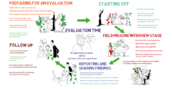 Would you rather read the manual?
Since that time, I have continued using visual tools: whiteboard animations and infographics, with evaluation teams, to distil and share evaluation findings and lessons. My experience has been that these tools add to the evaluation process and outcomes in a number of interesting ways.
Visual Tools Encourage a Holistic and Fresh Perspective
In order to consolidate an evaluation’s findings into a short animated ‘story’, an evaluation team must think carefully about the people, events and decisions which have been most significant, asking themselves questions like: – Who was on the stage in each scene? “Who were the most important characters?” “Who stayed in the background?” “Who moved to the foreground as the story developed?”.
Through this process, insights emerge: “it was important that these people were here at that point…”, “they said they would come, but actually they never did…”. “This WAS the turning point”.

Was this a turning point?
As they select the images to use, the group need to think about what the results and impact look like: “Are there concrete changes that can be shown in the animation?”
Who and what changed?
At what point in the story do these changes begin to emerge? “… Questions like these can lead to useful discussion on the indicators of change including some which may be unexpected, or more important than predicted.
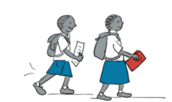
Which change was most valued?
I’ve found that people tend to interrogate an image more closely than written text, often spotting patterns as well as inconsistencies in the analysis. Sometimes, I create a visual representation of what has been written in an evaluation report, which evaluation team then finds ‘doesn’t look quite right’.

“That’s not what we meant…”
For example, an evaluation report of an organisation’s approach to gender referred only to women in the text. When the evaluation team reviewed the storyboard, I’d created for the animation (showing only women), they saw that groups of people, who should have been considered and mentioned in the report (such as young men and older people), had not been included. Based on this insight, we were able to revise the animation (and the team’s insights and learning) to give a fuller picture of what was happening.
Have we missed someone?
Visual Tools Increase Participation and Ownership of Results
Creating a whiteboard animation lends itself to a participatory and inclusive approach because – just in the same way as you use a whiteboard – images can be sketched, developed, erased and redrawn. New characters and words can be added as you go along.

“Yes, that’s how it happened…”
I’ve found that many people are more likely to participate in discussing results when these are summarised in a picture. It’s easier to critique an image, or suggest changes to it, than to criticise each other, or a report. The gulf between the field staff, who may be more used to oral communication (and have less time to read reports), and the ‘report writers’ in the office, narrows.
As a picture or an animation is revised, the group gradually comes to a shared understanding of what happened and what was significant and important. Their ownership of the findings makes them more likely to share them with others.
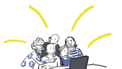
“That was my idea…”
Visual Tools Help Evaluation Findings Reach More People
Animations and infographics are easy to share by phone, email or in a meeting. Looking at them takes only a few minutes of busy people’s time so they are less likely to be put aside to read later. An interesting animation will also encourage people to find out more by consulting the full report.
Would they have read the report?
When information is presented through images as well as words, people build up two mental representations (verbal and visual) and make connections between them. Images literally help us see what people mean. So, using visual tools helps make evaluation findings easier to digest, understand and remember.
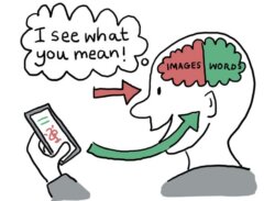
You will remember this!
And Visual Tools Can Do More!
To date I’ve worked mainly with evaluation teams and project staff at the end of the evaluation process. I believe the benefits for reflection and learning could be even greater if we could introduce visual tools at an earlier stage and work with a wider group of stakeholders.
Could You Use Visual Tools in Your Evaluations?
There are some simple visual tools, like sketch noting, which are easy to incorporate into evaluation processes. Whiteboard animation programmes like Videoscribe are intuitive and easy to use to create short animations to share findings.
If you have the resources available, I recommend including a visual practitioner on your evaluation team. The International Forum of Visual Practitioners has a worldwide network of experienced practitioners and is a useful place to start looking.
I’m interested to continue developing and learning about the use of visual tools, not only to share evaluation findings, but earlier in the evaluation process to allow a wider group of stakeholders to participate, reflect and learn. Please contact me if you want to get involved or have experiences to share.
This article has been reposted from Harriet Matsaert Visual Tools.

